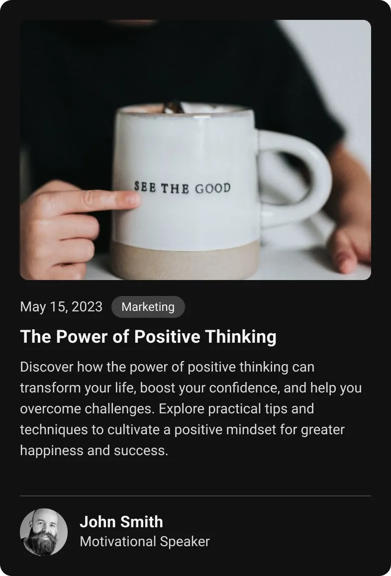
Basic Blog
In this guide, we will explore the BlogCard component, a versatile and visually appealing way to display blog information in a structured and engaging format. This component is designed to be flexible, supporting both horizontal and vertical layouts, and includes several key features that enhance the presentation and accessibility of blog content.
Implementation Details
It uses conditional rendering based on the isHorizontal prop to determine the layout style. The component is styled using nativeWind, which allows for rapid development and customization.
This component not only enhances the visual layout of blog posts but also improves the overall user experience by providing a clean, organized way to present important information at a glance.
UI Preview


Usage
To use the BasicBlog component, import it and provide it with the necessary blogData. Here is a basic example:
import React from "react";import { BlogCard } from "@app-launch-kit/components/custom/blog-card";
import blogData from "./data";
export const BlogCardBasic = () => {  return (    <BlogCard      publishedDate={blogData.publishedDate}      category={blogData.category}      title={blogData.title}      description={blogData.description}      authorName={blogData.authorName}      designation={blogData.designation}      authorProfileURI={blogData.authorProfileURI}      bannerURI={blogData.bannerURI}    />  );};